What happens when equitable design isn’t at the forefront of UX
Hey everyone. I recently started Google’s new UX Design Professional Certificate program on Coursera and I’ve just ticked off Week 1! ✅ This week, I touched on an area of UX that I’ve not really explored enough. 👀
I wanted to share one of the practical exercises with you as I haven’t posted here in quite some time! ⏰
For this activity, I had to analyse the user experience of two fictional pizza ordering apps 🍕and choose the one I felt had a better UX.
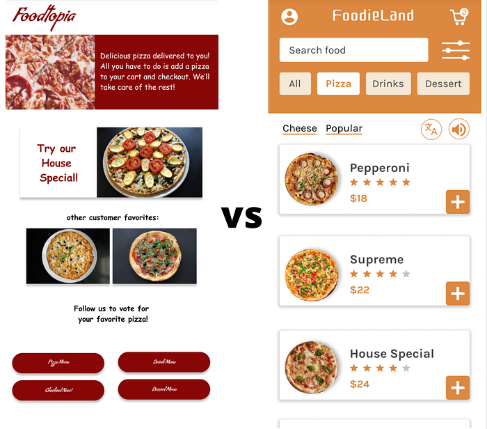
Although there were many observations, I wanted to focus on equitable design for today.
So why is equitable design important?
Well, there are 1 billion people in this world who have some form of accessibility requirement. These could stem from motor, visual, hearing, or cognitive impairments or disabilities. So much of our modern world today is experienced through digital technology. With just a few clicks, we can access education, news, information and opportunities all online. When you think back on how you applied for your job, you most likely used a word processor to create a CV, and then you sent it to your prospective employer. When you were too sick to prepare food, you most likely ordered it on an app and then food was delivered to your home. As we can see, technology when used consciously and well does have its benefits.
As a child, my dad used to fix internal parts of electrical goods and he used to always ask me which wire was green, which was blue, or which was yellow because his colour blindness meant he couldn’t tell the difference between those colours. Sometimes we need some assistance to complete the task at hand.
Now flash forward to 2020 and imagine you can’t go to your bank branch to pay your bills or deposit a cheque due to Covid-19 restrictions. Much like everyone else, you’re suddenly forced to manage your finances through apps. But imagine you also had a visual impairment and the button text was too small for you to read with low vision. Or maybe the button didn’t stand out to you at all because it blended in with the rest of the design. Then you’re not able to move through the user journey and finish making that bill payment. Or maybe digital literacy was an issue and you didn’t know how to download the banking app in the first place. All of these accessibility requirements could cause you a lot of worry and you might give up on it completely.
Clearly, the design of that website or that app wasn’t designed in a way that you could accomplish your tasks easily. This is where equitable design comes in. Going back to my childhood story, instead of me standing next to my dad and assisting him with colour, what if apps could have accessibility features that are already integrated into the design?
UX designers must ensure that it’s a positive and engaging experience for everyone, not by adopting a universal design one-size-fits-all approach, but designing more inclusively with a focus on those who have in the past been under-represented. This means acknowledging that not everyone is the same when it comes to vision, hearing, cognitive, motor abilities, native language, culture, and digital literacy.
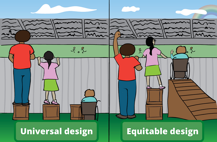
Equity-focused design is often an overlooked area but we can see from the examples below just how much of a big difference it makes to user experience and accessibility. I love the image below because it clearly shows the difference between a universal design and equity-focused design. With a universal design, everyone gets the same box to stand on, but that still means not everyone can enjoy the show. But when we are taking an equity-focused approach to design, people get boxes of different sizes so everyone can achieve the same outcome and can enjoy the show.
But what do these boxes mean in terms of an actual app? This means making conscious design choices like high contrast elements, iconography, writing in plain, jargon-free language and developing features like closed captions.

Now onto the practical exercises!
Example 1 — Foodtopia
Foodtopia (screenshots below) is an example of where equitable design was not a focus from the start.
We can see that there is no audio-visual option for visually-impaired users and no translation features for users who are not native English speakers.
There’s no information about ingredients here. Users who have allergies or intolerances require information on whether a dish has gluten or dairy in it. As this is a food app, these features must be considered. We can not assume a one-size-fits all approach when it comes to food.
Looking at the example below, you can see that not only are the CTA buttons hard to read due to their awkward font, but they are missing icons too. We always need to include icons for non-literate users who rely on symbols to navigate websites and apps.

I also noticed that Foodtopia didn’t use any photos to go alongside the pizza names. Photos are not just about fancy images making the interface look pretty. The lack of photos could be really problematic for non-literate users who rely on more visual cues.
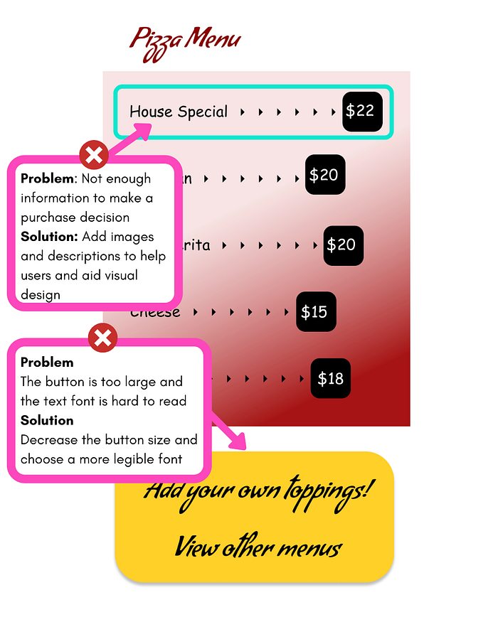
I noticed that bright yellow text was used on the toppings screen. This would be visually demanding for most users with high vision, but it would be even more demanding on users with visual impairments. It is always better to choose a higher contrast ratio for improved readability.
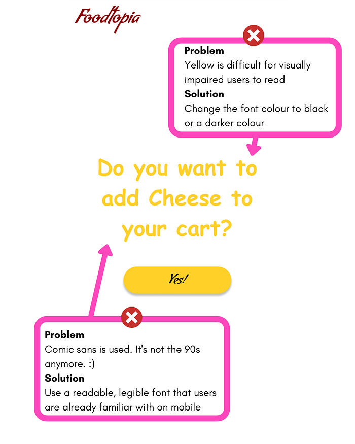
Once users have chosen their pizza and they’re ready to order, they might want to provide more instructions to their delivery driver. Sometimes the delivery driver requires them to meet them in the parking area or somewhere outside of their home. In this case, Foodtopia doesn’t allow wheelchair users to indicate that they may need some mobility support. These are all things that UX designers need to consider while designing a food app that is inclusive of all its users no matter their physical abilities.
Example 2 — FoodieLand
Foodieland (screenshots below) is an example of a more equitable design, but it’s still not quite there yet as we’ll see.
We can see that there is a translation feature so users can translate the app’s content into their preferred language. There’s also the audio-visual option to hear the app’s content. It’s off to a good start!
There are tabs for pizza, drinks, and desserts and users can also see a breakdown by cheese and popular pizzas. However, this need for structure needs to be balanced out with the fact that more complicated navigation may elongate the experience for those users who use screen readers as there is more content to sift through.
Again, we’re not seeing food intolerances or allergy information surfaced here. Users who have dietary concerns need to know whether there is gluten or milk in their pizza in order to make a decision. Having the feature to filter gluten-free or dairy-free pizza would make a huge positive impact on the user experience for these users.

On the positive, the contrast ratio of the elements seems to be good. But it needs to be tested using plugins that show what it would look like to a colourblind user.
I was disappointed to see that photos can’t be enlarged. Seeing what the food looks like in closer detail would make a big difference for users with visual impairments.
In addition, if users want to customise their toppings, they have to dig around for it a bit as it’s hidden below the ‘add to cart’ CTA button. All of these small design features make it much more demanding for users with visual impairments.

Where can we go from here?
Being mindful of equitable design makes a huge difference to user experience as we’ve seen from the examples above. Although Foodieland wasn’t without its issues, it was better than Foodtopia because it had more of an equity-focused design. That’s why accessibility and equity-focused design really should be as important as how we value utility and usability.
Mobile phones and computers are a relatively new invention in human history so we are at a really exciting time where UX designers can lay out the design foundations for future generations.
As UX designers build products for people, the goal should be to include as many people of different abilities as possible so that as many people can benefit from technology as possible. Thus, equity-focused design should always be part of the design process rather than perceived as an add-on.
